
Satellite-based terrain visualization for environmental monitoring and presentation of relevant observations
STUPRO is a University software project we have been working on during the last year. This project is part of the Bachelor program “Software Engineering” at University of Stuttgart.
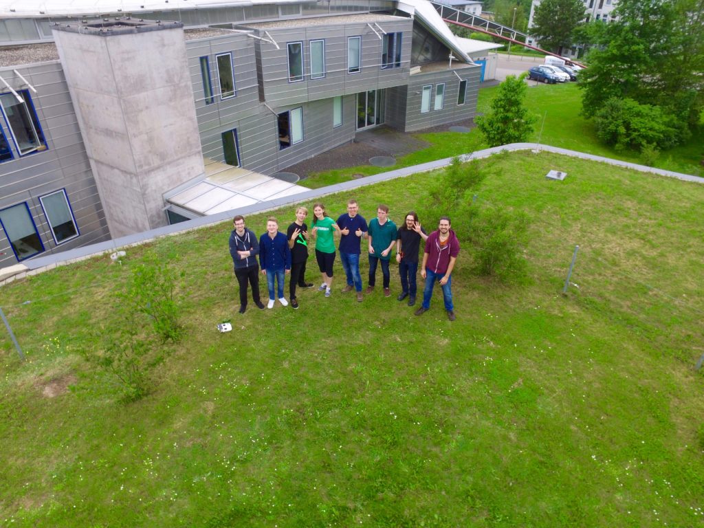
The Team
Our team consisted of Adrian Zeyfang, André Wruszczak, Jan Machnik, Jan Tagscherer, Jonas Auer, Karl-Heinz Theil, Larissa Laich, Marcel Warbeck, Paul Dieterich, Tobias Beeh and me:
The Project
During the project we developed “Kronos“, which is an extension on top of the open-source project Paraview. The goal of this project was to visualize different data-sources on a globe-view including earth-texture.
Kronos is capable to import and visualize many different data-sets. They are described in the following abstracts.
Terrainvisualization of Earth
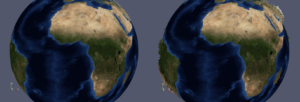
The earth is the center part of Kronos. It can be visualized as 3D-globe or as flat 2D-map. All additional data-sets are rendered on top of this globe.
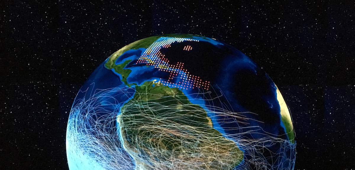
Visualizing Data-Sets from the SciVis-Contest 2014
The SciVis contest 2014 offered data-sets from three different sattestes: MIPAS, AIRS and CLaMS. All these data-sets can be visualized within Kronos, on a 2D map and a 3D-globe.
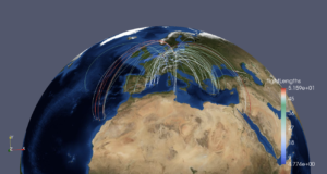
Visualizing Flight-Data
Flights can be filtered by airlines, airports and flight length. Flights can be visualized as starts and end point or using geodesists.
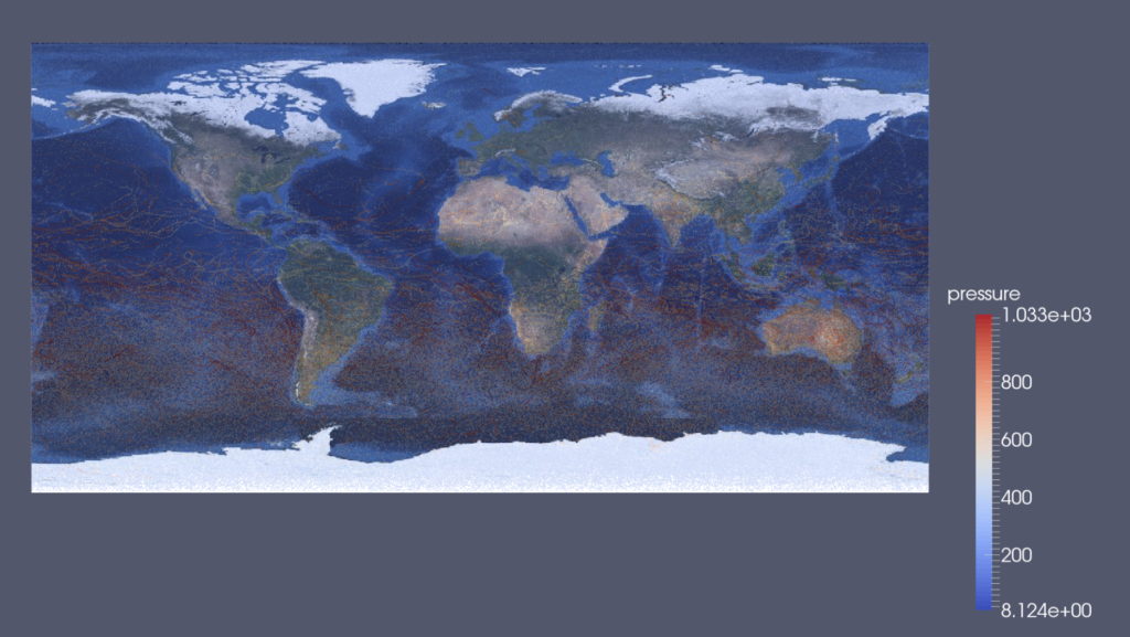
Visualizing Climatic Data and Weather Data
Temperature
Temperature can be visualized as heatmap and can be filtered for minimum and maximum temperature. Different filters are also available which can aggregate and interpolate on time and area.
Precipitation
Precipitation can be visualized as heatmap. It can be filtered by type of precipitation. Temporal aggregation, temporal interpolation, areal interpolation are also available as filter.

Wind
Wind can be visualized as heatmap or as flow visualization. Temporal aggregation, temporal interpolation, areal interpolation are available as filter as well.

Searching for Locations and Visualization of Cities

Twitter-Data
Twitter data includes author, hashtags, keywords and number of retweets. It can be filtered by these properties. The result can be visualize as heat map.
Powerwall Compatibility
The powerwall is a huge display that has been built by the visualization institute of our university. It offers a resolution of 10’800 x 4’096 pixels. This corresponds to a resolution of 44 megapixels. The powerwall is powered by 10 4K-beamers which sit behind the screen.
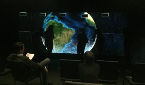
Our software has been optimized to run on the computation-cluster of this powerwall. It was great to see Kronos run on the big screen.
Open Source
The Source code of Kronos is available on GitHub: https://github.com/frogg/STUPRO
If you liked this article, you can follow me on Twitter and subscribe to my newsletter to stay up to date.